When it comes to interior design, incorporating bold colors can add a vibrant and dynamic touch to any space. However, using bold colors requires careful consideration to avoid overwhelming the room or creating a chaotic atmosphere. In this article, we will explore the dos and don’ts of incorporating bold colors into your interior design, helping you create a visually appealing and harmonious space.
Do: Start with a Neutral Base
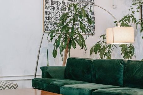
Before adding bold colors to your interior design, it is essential to start with a neutral base. Neutral colors such as white, beige, or gray provide a calming backdrop that allows the bold colors to shine. By using neutral tones on walls, floors, and larger furniture pieces, you create a balanced foundation for the bold colors to make a statement.
Don’t: Overdo It with Bold Colors
While bold colors can be exciting and eye-catching, it is important not to overdo it. Using too many bold colors in one space can lead to visual chaos and overwhelm the senses. Instead, choose one or two bold colors as accents and use them strategically throughout the room. This will create a cohesive and visually pleasing design.
Do: Use Bold Colors in Small Doses
To incorporate bold colors effectively, use them in small doses. For example, you can use bold-colored throw pillows, curtains, or artwork to add pops of color to a neutral room. By using bold colors sparingly, you create focal points and add visual interest without overpowering the space.
Don’t: Neglect the Color Wheel
Understanding the color wheel is crucial when incorporating bold colors into your interior design. The color wheel helps you determine which colors complement each other and create a harmonious palette. Choose colors that are opposite each other on the color wheel (complementary colors) or colors that are next to each other (analogous colors) to create a visually pleasing and balanced design.
Do: Consider the Mood and Function of the Space
When selecting bold colors for your interior design, consider the mood and function of the space. Different colors evoke different emotions, so choose colors that align with the atmosphere you want to create. For example, warm and vibrant colors like red or orange can create a lively and energetic space, while cooler tones like blues or greens can promote a calming and relaxing environment.
Don’t: Forget About Lighting
Lighting plays a crucial role in how colors are perceived within a space. Natural and artificial lighting can affect the intensity and hue of the colors in your interior design. Before finalizing your color choices, consider how the lighting in the room will impact the colors. Test the colors under different lighting conditions to ensure they appear as desired.
Do: Experiment with Bold Color Combinations
Don’t be afraid to experiment with bold color combinations in your interior design. Mixing different bold colors can create a unique and visually striking space. However, ensure that the colors you choose still work well together and don’t clash. Use the color wheel as a guide to find complementary or analogous color combinations that harmonize well.
Conclusion: Achieving a Harmonious and Vibrant Interior Design
Incorporating bold colors into your interior design can transform a dull space into a vibrant and visually stimulating one. By following the dos and don’ts mentioned above, you can create a harmonious and balanced design that showcases your personality and style. Remember to start with a neutral base, use bold colors sparingly, consider the color wheel, and take into account the mood, function, and lighting of the space. With these guidelines in mind, you can confidently incorporate bold colors into your interior design and create a space that is both visually appealing and inviting.