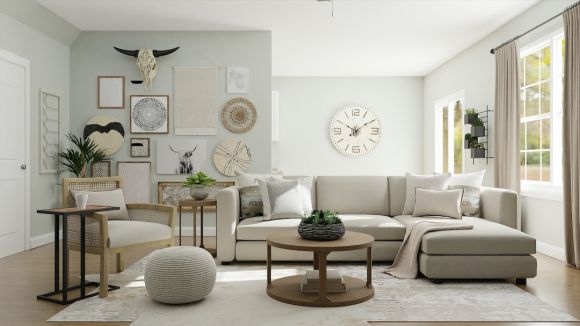
Designing the color palette for your home can be an exciting but daunting task. The right combination of colors can bring harmony and style to your living space, while the wrong choices can create a chaotic and unbalanced atmosphere. To create a cohesive and stylish color palette, consider the following tips and tricks.
Understanding Color Theory
Before diving into selecting colors for your home, it is essential to understand the basics of color theory. Colors can be categorized into three main groups: primary, secondary, and tertiary. Primary colors are red, blue, and yellow, which cannot be created by mixing other colors. Secondary colors are created by mixing primary colors, such as orange, purple, and green. Tertiary colors are formed by mixing primary and secondary colors, resulting in shades like turquoise, magenta, and lime green.
Creating a Color Scheme
Once you have a grasp of color theory, it’s time to create a color scheme for your home. One popular method is the 60-30-10 rule. This rule suggests using one dominant color for about 60% of the space, a secondary color for 30%, and an accent color for the remaining 10%. This technique ensures balance and prevents overwhelming the eye with too many colors.
Choosing a Dominant Color
Start by selecting a dominant color that will set the tone for your space. Consider the overall mood you want to create. If you desire a calm and serene atmosphere, opt for cool colors like blues and greens. For a more vibrant and energetic feel, warmer colors like reds and oranges may be suitable. Remember to take into account factors such as lighting and the purpose of the room. Darker colors may make a small room appear even smaller, while lighter shades can create an illusion of space.
Selecting Secondary and Accent Colors
After choosing your dominant color, it’s time to select secondary and accent colors that complement it. Secondary colors should harmonize with the dominant color, creating a cohesive overall look. For example, if your dominant color is a soft blue, consider pairing it with secondary colors like pale yellow or light gray. These combinations will create a balanced and visually pleasing palette.
Accent colors serve as pops of color that add interest and personality to your space. They can be bolder and more vibrant than the dominant and secondary colors. Use accent colors sparingly to prevent overwhelming the design. A few strategic pops of color through accessories, artwork, or small furniture pieces can make a significant impact.
Consider the Color Wheel
The color wheel is a useful tool when selecting colors for your home. It shows the relationship between colors and allows you to create harmonious combinations. One common technique is to choose colors that are adjacent to each other on the color wheel, creating a monochromatic scheme. Another option is to select colors that are opposite each other on the wheel, known as complementary colors. Complementary colors create a bold and dynamic look when used together.
Test Before Committing
Before committing to a color scheme, it is crucial to test the colors in your space. Paint small swatches on the walls and observe how they look in different lighting conditions throughout the day. Consider how the colors interact with the existing elements in the room, such as furniture and flooring. Testing the colors will help you visualize the final result and make any necessary adjustments.
In conclusion, creating a cohesive and stylish color palette for your home requires a thoughtful approach. Understanding color theory, using the 60-30-10 rule, and considering the color wheel are valuable tools in achieving a harmonious design. Remember to test the colors before committing to ensure the final result aligns with your vision. With these tips and tricks, you can transform your living space into a visually stunning haven.


